How to Make Sure Your Lead Capture Form Isn't Driving Visitors Off
In our previous article on landing pages, we talked a little bit about the all-important lead capture form. This is the central focus of your landing page, the form where people will actually input the information that you’ll use to push them further along your marketing funnel.
We’ve previously discussed a little bit about how to pair your form with appealing images, a strong call-to-action, and other design elements, but if the form itself is truly the most important of the page, then it deserves an article of its own. Let’s take a closer look at the factors that influence visitor abandonment, and how you can set your lead capture form up for success.
Placement
It’s important to carefully consider where you want your lead capture form to show up. A good rule of thumb is to make sure the viewer sees if after they’re reassured that they can gain something of value from you.
It stands to reason that you want your lead capture form to be visible and easy to access. But be warned: If your new viewer is just greeted up front with a form to input all their personal information without knowing what you have to offer, there’s little chance of conversion. If you present the form before properly explaining your offer, there’s a high chance of your visitor abandoning the page before you get the chance to connect with them.
It’s a delicate balancing act, though - you want the form to be readily available for interested users, but not so upfront that curious clickers will be put off by demands for their information. Put the form too far down the page and you’ll also decrease your chances of conversion, since few viewers will take the time to read and explore your entire page on their first visit.
Try to imagine how a first-time visitor will be viewing your page when you’re deciding on where to place your lead capture form. You can workshop a few different versions with A/B testing to determine the best option. Avoid having a pop up-style form show up right when a viewer clicks onto your landing page. Most people will find this irritating - they’ll have no idea of what you’re even about since they haven’t had a chance to browse your page yet. It's best to have a pop up appear after they've had a little time to explore.
Placing your form next to a special offer, video, or some other piece of content is a good way to entice the viewer and make your business seem more legit prior to engagement.
Make a Decision On Quality vs. Quantity
A general rule of thumb for a lead capture form is that you want as few fields as possible for the user to fill out. It shouldn’t feel like work to sign up for a list or learn more information. People already work enough in their day-to-day lives, they don’t need you giving them more to do!
Ideally, a simple email address would be all that’s required. Check out Groupon's opt-in form:
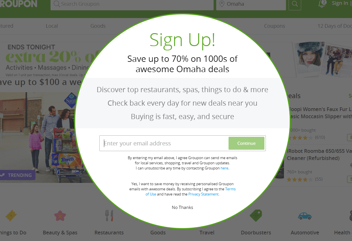
It's paired with a quick list of benefits and only asks for an email address, for maximum ease-of-use.
But that’s not always optimal. Some types of businesses will need a greater amount of information in order to qualify their leads and determine their usefulness.
Generally, when deciding on how many forms you want to include, it comes down to quality vs. quantity. You’ll have to decide what’s best for your business. If your form is shorter, you’ll get more leads. If it’s longer, you’ll have less leads but potentially more useful ones. If you’re just starting to grow your mailing list, then try to keep the forms to a minimum, but if you’ve already got a sizeable list it might be to your advantage to qualify your new leads with additional information.
If you do go the longer route, only include forms that you actually need. We can’t stress this enough. If you’re not going to actually employ every piece of information gathered in a concrete way, cut the field to reduce the intimidation factor. You'll also need to offer the visitor something tangible in return if you're expecting them to take the time to fill out your form.
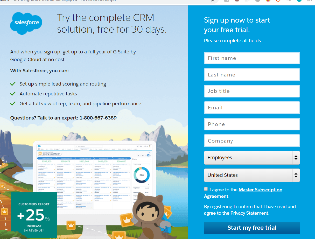
For Salesforce to qualify their leads, they need a greater degree of information from the customer. Though it may look like a lot of fields to fill out, Salesforce incentivizes the visitor to complete it with a "Start my free trial" call-to-action.
Getting Rid of Friction
Generally, people don’t want to put a lot of effort into something that they don’t know much about. If they see a huge form to fill out, it can seem like some immense, impossible task, even if realistically it would only take them a few minutes. This resistance is often referred to as “friction”, and it’s that intimidation factor that causes visitors to bounce before they can become leads. There are a few things you can do to help create less friction with visitors and make your lead capture form more user-friendly.
Friction can happen both before the visitor gets started on the form and while they’re filling it out. Let’s start with what to do to reduce friction upfront.
Friction Before the Form
There are a few things you can do to alleviate friction that visitors may be feeling prior to filling out your lead capture form.
The most obvious option is to reduce the number of fields as much as possible. Some businesses get creative with this, scaling back the number of text forms while still devising ways to get the same information. Check out this visual lead capture form by Creative Design Architects:
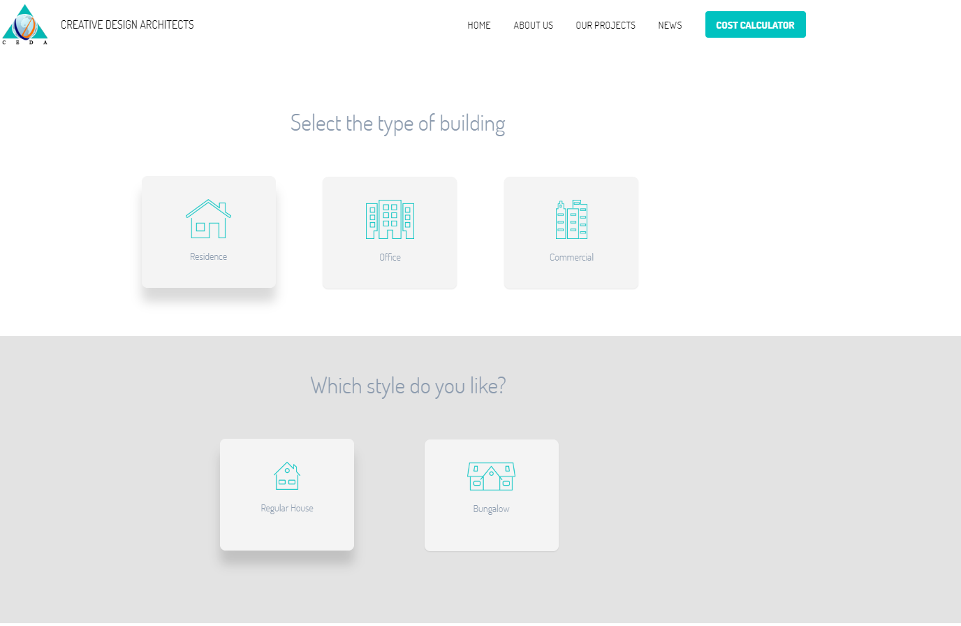
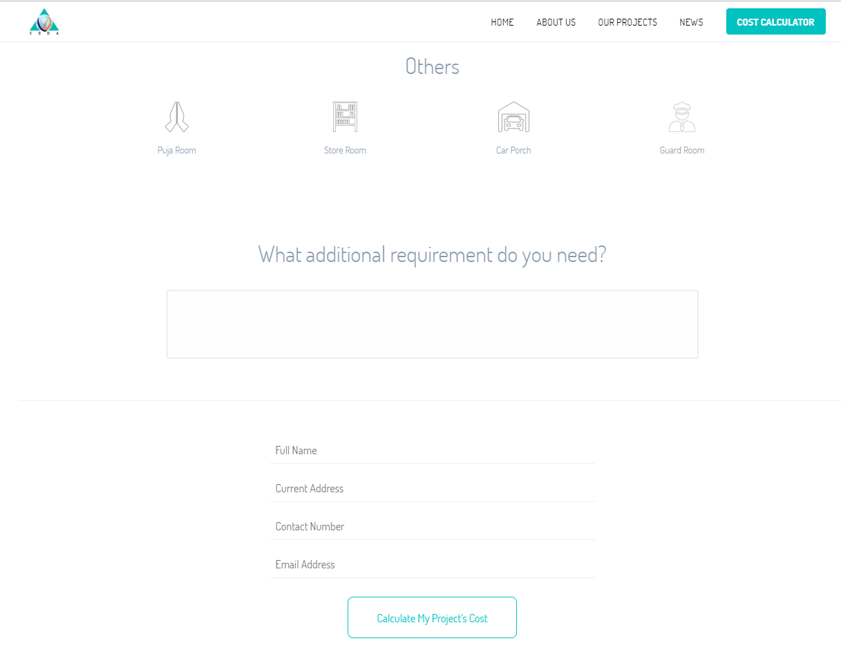
It gathers a lot of information to help Creative Design Architects qualify their leads, but it barely even feels like a form thanks to its intuitive design. Only towards the end does it actually ask the interested user to type anything at all.
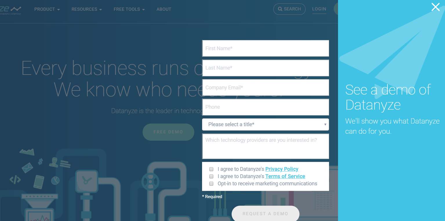
Another great option is a two step opt-in - let users be presented with an opt-in form after clicking a button with a strong call-to-action rather than presenting it right up front. That way they feel more in control of the process and undergo less associated stress. Datanyze has their form slide in though the side of the page only after the visitor clicks the "Free Demo" button:
One method of increasing conversion that has become quite popular recently is gamification of the lead capture form. Plugins like Listagram and others add an element of chance and reward to the opt-in process.
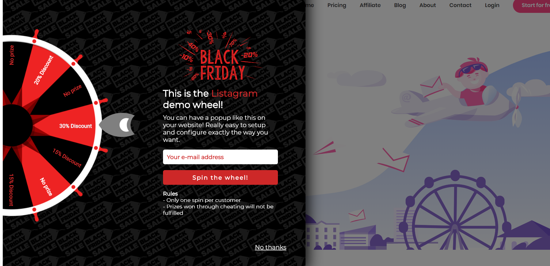
Upon visiting the site for the first time, the user is presented with a virtual wheel that they can spin to win prizes like free shipping or discounts. While this is obviously not a viable option for every ecommerce business, it can have a huge effect on conversion rate for many.
If you absolutely need the text forms, and your form really must be super long, consider splitting it over more than one page. That way the visitor won’t feel the same sense of friction when they’re just getting started. Check out how Single Grain presents their lead capture form:
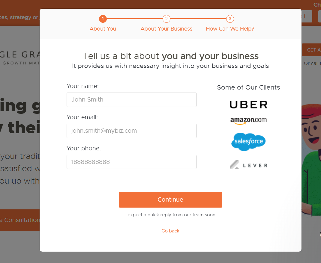
Though they're asking for a lot of information from the visitor, they've split it into more manageable chunks, with a helpful progress bar along the top so customers can track how long it will take them to complete the form.
Reduce Friction During the Form
Not everyone who starts on your form is going to take the time to finish it. Friction during the process can be just as much of a conversion killer as friction before. If your form is too difficult or your questions too nonspecific, visitors may abandon it partway through.
Mid-form friction may be caused by:
- Dropdown menus that don’t seem relevant to the user. The categories in a dropdown menu need to be very clearly differentiated. There should be no question as to what category the visitor is in upon first glance. If they don’t see a category that they feel adequately represents themselves, they might question whether your product is really for them. Always include an “Other” option to help reduce this risk.
- Overly complex questions. Generally, keep the open-ended questions to a minimum. Yours should be direct and easy to answer. The visitor shouldn’t feel like they have to struggle to come up with an answer to a form like “Explain the most significant factors causing issues with your business”. Something simple and direct like like “What is a problem you currently have with ____?” is much easier to answer.
Update Your Form As Needed
Once you’ve had a good chunk of people actually go through and fill your form out, you’ll have a better idea of what’s effective and what isn’t. If you have a question that isn’t giving you the type of information you want, consider removing or rewording it to reduce friction. For dropdown lists, put the category that most people pick towards the top of the list so that they can find it quickly.
Conclusion
On principle, your lead capture form should be as short and simple as possible. But since that’s not always an option, the choice of what information you ask for from customers should be carefully considered, and, as with any other aspect of your marketing, A/B tested for maximum results.
It’s a delicate balancing act to include all the information you need while still keeping it user friendly. But make your lead capture form a stress-free and easy experience for your visitors and you’ll be well on your way to building a towering mailing list.